You’ve created a beautiful sales page.
You’ve highlighted all your products, written stellar descriptions and shown off all your services.
But you haven’t made a single conversion.
No one’s buying.
It’s not a good place to be in, but there is a way out of it. It’s discouraging to put all your efforts into fine-tuning your sales page and getting meager results.
But, there’s a way to fix your sales page issues and get it converting those casual visitors to loyal customers. Get your website back on the right track and fix your sales page with some solid advice from our design and development teams.
Does Your Page’s Design Suck?
Your team probably put a lot of time and effort into the design of your sales page and were really proud of how it turned out, but in all honesty, is it what you hoped for? Take another look at your sales page or, even better, ask a neutral party to take a look at it for you.
Now, ask yourself these questions:
- Does your sales page offer complete clarity to your visitors and do they know, like really know, what your sales page is about?
- How’s your message getting across? Is it clear and easy to understand?
- Is your sales page appealing to your target audience?
- Is your sales page copy educational? Does it provide value to your customer or, are you obviously just trying to make a sale?
- How many little design features have you put onto your sales page? Do they really need to be there?
- Your landing page design should be clean and free of any distractions, is yours?
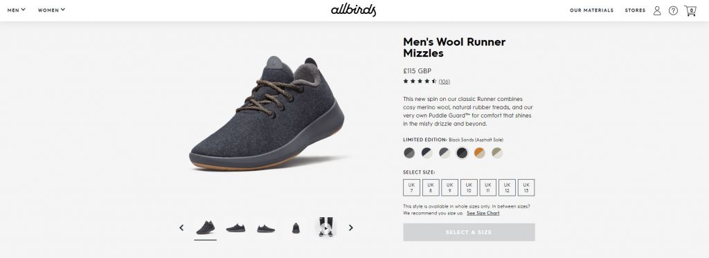
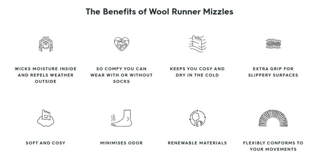
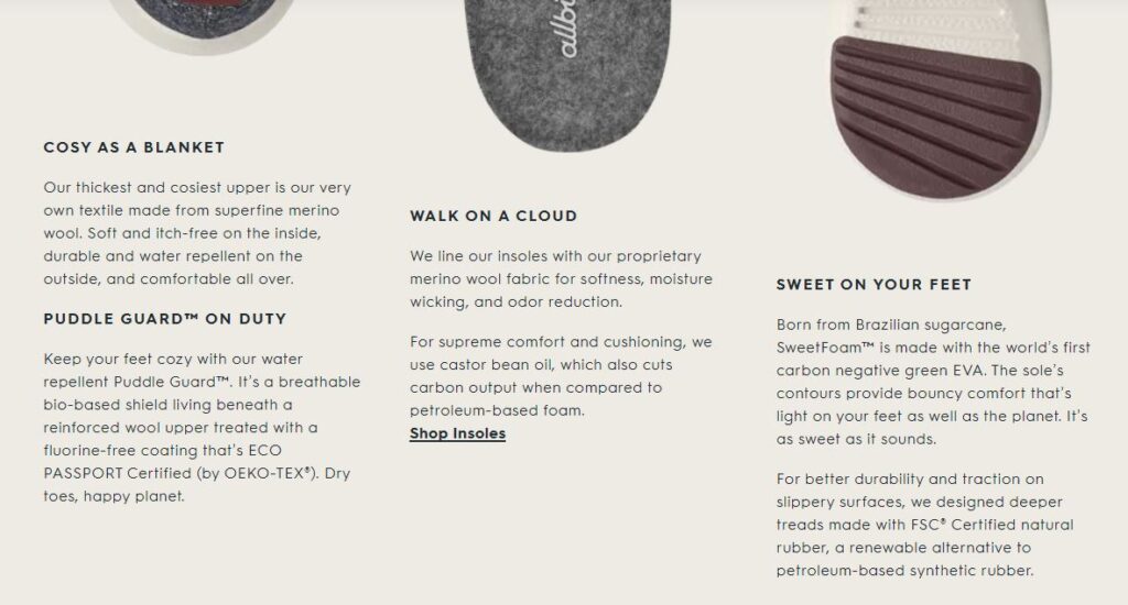
For the next few points, we’re going to use an example of a great product page for wool shoes, of all things. Keep these points in mind when going through your sales page:
- Use images that are relevant to enhance the product being sold.

- Use bullet points to highlight key features and benefits of your products.

- Use promo videos to demo your products and services.
- Make your copy easy to read and valuable to your customers.

If you’ve come to the conclusion that your sales page needs some drastic improvement then it’s time to take action now.
Are Your Offers Interesting?
Take a look at your sales page offer and ask yourself this:
Is it irresistible enough to make visitors want to take action and buy?
If not, it’s time to sit down and think about how you can make your offer(s) more appealing.
Is your product or service priced too low or too high? Perhaps you haven’t added enough compelling evidence (proof points) that what you’re selling is what people really need.
If there’s room for improvements anywhere here, do it!
How about creating a sales funnel that nurtures potential customers long-term? Give something valuable away for free and use it to promote your core premium offers.
A powerful tactic you might want to consider trying is something called ‘scarcity marketing’. You could create a special discount that is only available for a limited time/amount of products.
Does Your Sales Page Work Properly?
If your customers have to wait for your page to load then you’re in a seriously bad situation. Think about it like this, your customer wants to take advantage of your new offer, but your sales page isn’t loading, they’ve waited ten seconds, maybe fifteen, and then decide it’s taking too long.
What do you think will happen next?
They leave your website, go straight to a competitor and buy from them instead.
You need to take immediate action if your sales page is taking longer than it should take to load.
- Make sure your landing page is optimised for faster loading by resizing your images or using a tool like TinyPNG to compress their file size.
- Get rid of any unnecessary clutter that’s ruining your sales landing page. If the information isn’t relevant or absolutely needed, get rid of it.
Your Sales Page Isn’t Visible
You might be thinking that this is pretty obvious and nobody in their right mind would hide their sales page somewhere deep amongst the other pages of their website? Nah, that’d be silly.
But seriously, people spend a whole lot of time and energy carving out amazing sales pages with perfect copy and sleek design but then it’s just buried beneath thousands of other pages on their website.
You have to make sure your sales page is visible and easy to find – if it’s not visible then nobody is going to find it and make a purchase. What this means is you need to link it from every vantage point you can. This includes your main navigation bar, your blog sidebar, your footer, etc.
Make your sales page known!
Turn Your Features Into Benefits
You’ve probably heard this before and you probably don’t want to hear it again but we’re going to tell you anyway!
Features tell your customers what your products do. It might intrigue them and it might be exactly what they’re looking for but it won’t make the sale. Benefits sell products. Show your customers how your product can benefit them/make their lives better and they’re more likely to buy it.
Another way of putting it is that customers don’t really care about what your product can do, they want to know what it can do for them.
So, if your sales page is full of features and no benefits you should probably change it before you lose any more sales.
Do you still think your sales page is perfect?
I doubt it.
So, contact dijitul today and let us take a look at it.
Leave a Reply