Nearly every time we create a website for a client, we can almost guarantee the “F” word is brought up. By this we mean the “Fold”. Let me introduce to you what the fold is.
Newspapers originally used “The fold” as a term to describe the area above the fold mark when a newspaper is halved. This area would consist of their most eye-catching, extravagant, interesting news article in order to entice people to buy the paper. Web designers then thought it’d be a great idea to adopt this concept in order to suit content on a web page, meaning that the very few devices & screen sizes at the time would display the most important content on page load at the top.
For a long period of time, the fold was widely accepted in the world of the web, but in the last 2 or 3 years, it has well and truly been killed off. Here are my reasons why:
1- There are too many devices & screen resolutions to even come up with an average “fold” height.
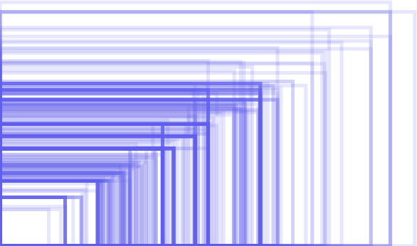
Just to put this in to perspective, have a look at this graphic that covers screen resolutions of android devices only:
Pretty insane don’t you think? So have a look at the smallest screen size and the largest. Do you think you can fit on those 3 call to actions, 1 slider, 5 images and 2 blocks of text comfortably? I don’t think so.
2- People have learnt to scroll, it’s a natural instinct.
Pretty much everybody has learnt that you can scroll on a website. A well working website will have content spread throughout it that you have to scroll to, not all squashed up together at the top. Saying this, people actually scroll in some cases before the page has even finished loading, so there may be a chance they miss your big shiny call to action that’s right at the top of the page.
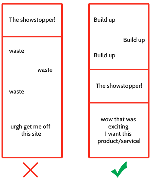
3- Why give away your showstopper straight away?
You need to make sure that your content is engaging. Tell your users a story, make them want to read and carry on reading down the page. If you give away your focus straight away, they won’t want to continue and will simply leave your site. Build them up to what you are trying to get them to see. If you have your user engaged in your content, this will discard the idea of a fold completely because of the flow of the content.
4- Your website will look beautiful.
Sticking to the “fold” concept would mean squashing your content and packing in as much stuff as possible in to the top of your website. Let’s be honest, this is not aesthetically pleasing. Work with your designer to actually design your content. Including plenty of white space so users are able to read the content properly, make it all flow, make the site look exciting so people want to read more. Aesthetics of a site have become such an important aspect of a website, that users will actually leave a site if they do not like the look of it. So take care in laying your content out.
These are just a handful of reasons as to why the fold concept is dead, and you should not feel as though you are tied to this. Let your content loose, tell your users a story and entice them in, make it exciting, make your website look well thought out and eye-wateringly beautiful and your users will forget all about the so-called “fold” concept.
At Dijitul, we are passionate about providing the best products for our clients and working closely with them. If you would like to work with us on your website and for us to provide you with the best skills and expertise , then give us a call on 01623 650333.


Leave a Reply